Wednesday, April 02, 2014

All new articles will only be on my website starting April 1, 2014

As of April 1, 2014, all new articles and information will only be located on my website at www.ThinkOutsideTheSlide.com and items will not also be posted here. This blog started when there were only a few options available to those who wanted to distribute their content, and Blogger was a good option back then. Today, there are better options.

The content on my site will allow you to still comment by using Google+, which cuts down on the spam comments that I have to manually moderate. If you subscribe to this blog via RSS, here is the new URL to subscribe to so you continue to get updated information on how to create effective PowerPoint presentations:

http://www.thinkoutsidetheslide.com/category/home-page/feed/

I do not plan to maintain this site in the future, so some of the links may end up being broken over time.

Thank you for following me here and I look forward to seeing you on my website at www.ThinkOutsideTheSlide.com.


Dave
Thursday, March 20, 2014

April 10 workshop in Toronto on turning Excel data into visuals for executive presentations

Professionals who present financial or operational data say there are two key roadblocks to them using effective visuals instead of the spreadsheets, tables, and complex graphs they are currently using. First, they need to know what visuals work for the different messages they deliver. Second, they need to know how to create these visuals in PowerPoint.

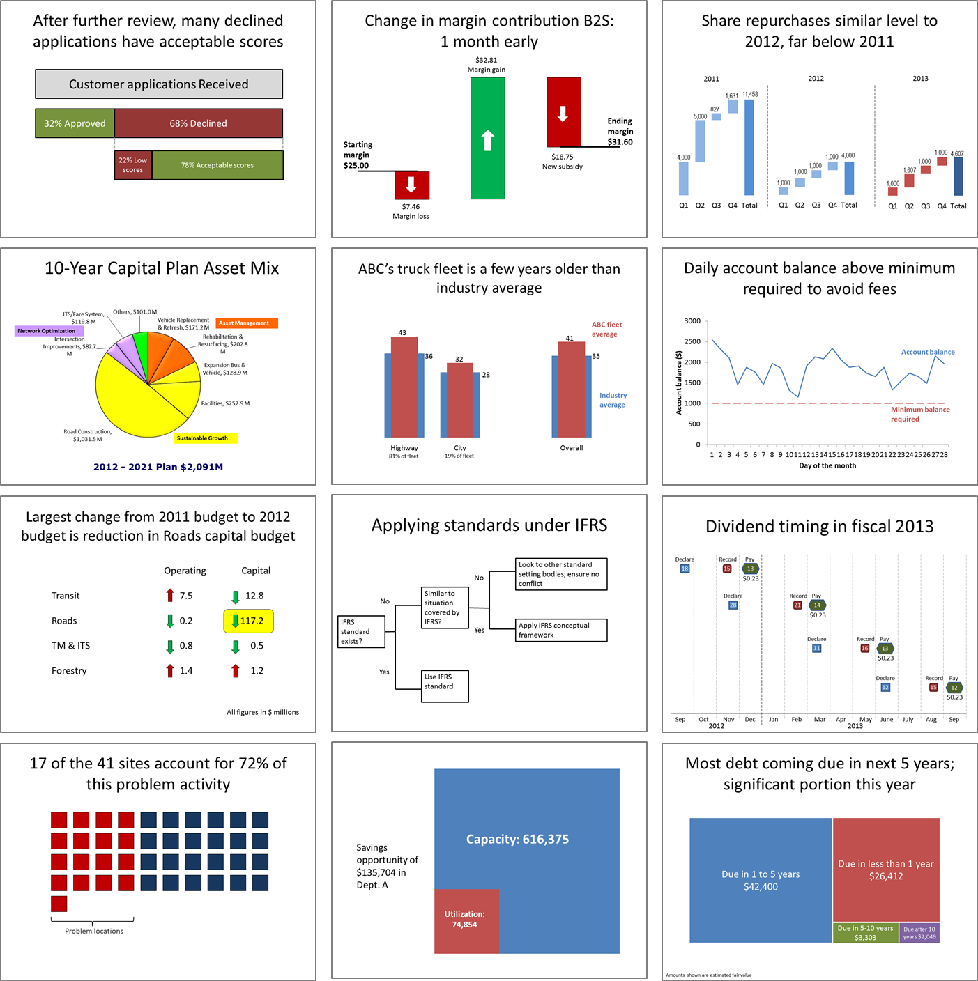
My workshop on April 10 in downtown Toronto will show you how to overcome these roadblocks. You will see many different visuals from real presentations, and you will be hands-on in PowerPoint practicing the techniques that are used to create the visuals. The full details of all you will learn are on my website at www.MakeNumbersVisual.com.

Who should attend this workshop? Anyone who: 1) has to present financial or operational data in their presentations, 2) knows that there must be a better way than using spreadsheets on slides, and 3) is willing to learn new visuals that are more effective.

If you are in the Toronto area, plan to attend. You will walk away will skills that will make your next presentation more effective.


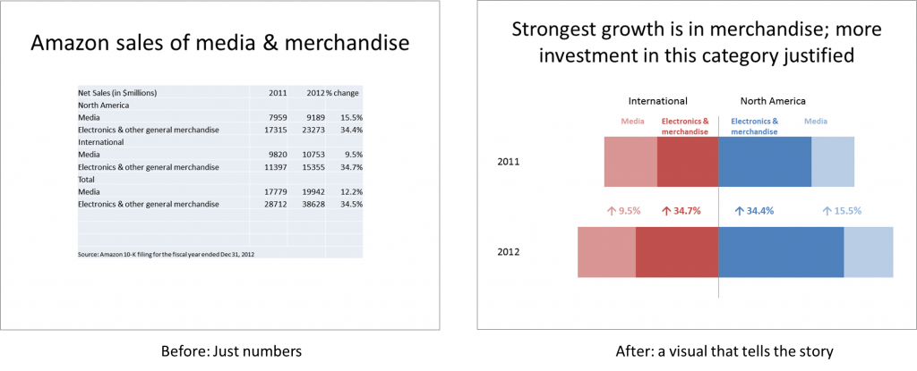
Here are some of the visuals you will learn how to create:

Tuesday, March 18, 2014

Presentation Insight: Numbers only measure a story

Why do presenters use so many spreadsheets and tables of numbers in their presentations? The answer I get from participants in my workshops is that the numbers and analysis are important. The audience needs to see all the numbers. In this article I want to explain why I think that the numbers are not as important as presenters think they are.

What are the numbers really? They are measurements of something going on in the organization. It could be sales, inventory, shipments, headcount, square footage, or any of the literally thousands of things that get measured in every organization today. And by themselves, they don't mean much.

What we do is we compare the measured values to some desired state, such as last year's number, a budget amount, a projection, an industry average, or other relevant number. Why do we do the comparison? Because we want to get a sense of whether the measured value indicates good or poor performance. So are these the numbers that are important? Not yet.

Here is the key I want you to understand. Numbers, whether measured or derived from analysis, only measure an underlying story of what is going on in your organization. Your audience wants to know that story, not the numbers. This is a fundamental shift in thinking for many professionals who present financial and operational data. Only include numbers when they are used as support for the story you are sharing. Don't think that the numbers are the story, because they aren't.


In a workshop last year I observed that the slides the participants were using each week to report to management contained lists of the breakdown of sales into categories and whether those were favorable or not compared to the budget. The numbers weren't even in tables, they were incorporated in bullet points of text so that the executives had to hunt to find them. Not effective at all.

Here is the question I asked that group to consider when deciding whether to include a number on a slide: "Is the situation these numbers describe important enough that action is necessary?" If not, don't include the number. The executives don't care about the number. They care about whether it indicates a situation they need to make a decision on. If it doesn't require a decision, leave it out of the presentation.

When you take the perspective that the numbers are not as important as the story they are telling, you actually end up changing the analysis you do. You become more focused on creating a message supported by the analysis. And when you want to tell that story visually, you can create effective visuals from the numbers. That's why I launched the What Visual To Use site to help you select the best visual for the message your numbers are telling. If you want to join me in Toronto or Denver to learn how to create visuals that work for financial data, register for my hands-on workshop.

Tuesday, March 04, 2014

3 Big Mistakes professionals make when presenting financial or operational data to executives

Do you present financial or operational data to executives? Make sure you aren't making these three mistakes.


Tuesday, February 18, 2014

Presentation Insight: Are your slides Re-Tweetable?

What does Twitter have to do with effective slides in your PowerPoint presentation? A lot more than you think. This occurred to me last week as I was helping a client prepare a presentation for an upcoming investor conference. Twitter gives us an interesting way to measure how much of an impact a message makes when someone reads it. If they understand and like the message, they retweet it and mark it as a favorite.

So why should this matter to presenters? Because we want the key messages in our presentation to have an immediate impact on our audiences. We want the audience to understand the messages, see how the messages impact their life or business, and act on those messages. Not that much different from what a good tweet does.

So which tweets have the most impact? Those that have effective images attached. This research from Buffer shows that tweets with images received 89% more favorites and were retweeted 150% more than tweets without images. The most retweeted tweet of 2013 (Lea Michelle thanking fans for their support after the death of Cory Monteith), and the most retweeted tweet of all time (US President Barak Obama's re-election in 2012) both contained images. In our presentations, if all we are using is text, we are missing a great opportunity to be memorable. By using visuals, we can increase the impact of our presentation.

But it is not just adding any old image and assuming just the presence of the image will make the presentation better. A random image attached to a poorly structured tweet won't get much attention. There are two parts of effective tweets that presenters can adapt: the well written text tweet, and the interesting, meaningful visual.

On a slide, the equivalent to the text tweet is the slide headline. An effective tweet usually isn't just a topic statement. It explains the key message in 140 characters or less. You can write quite a lot in 140 characters. Don't be afraid to write a longer headline that summarizes the key point you want the audience to understand from your slide. And limit yourself to one key message. Just like on Twitter, if you have another point, you send another tweet. If you have two points to make, use two slides, each with its own headline. The message in the headline should be so important that the viewer wants to see and hear more from you about this point.

The equivalent to the Twitter picture is a visual on your slide that illustrates the message in the headline. If you are comparing numbers or values, use a graph, proportional object collection, grouped item comparison diagram, or other visual that shows the difference in values. If you are talking about the relationship of events over a time period, use a timeline, Gantt chart, or calendar diagram. There are many other visuals for other types of situations or messages you are communicating. The visual helps solidify the message in the mind of the viewer.

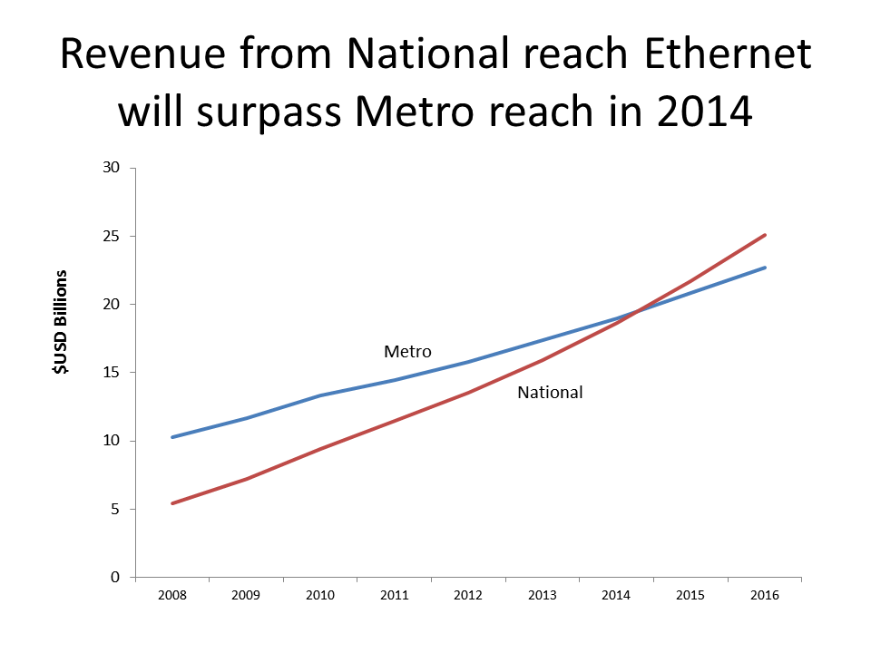
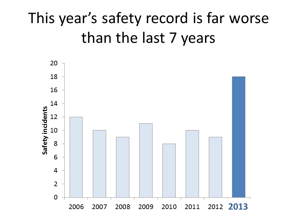
Here is an example of a slide with a clear message in the headline, and a visual that illustrates the point.


With a clear headline and a meaningful visual, your slide becomes something your audience wants to share with others. Even if you are not on Twitter, if you make your slides Re-Tweetable, you will improve the effectiveness of your presentation.

Tuesday, February 04, 2014

Presentation Insight: 3 Tips for making column graphs even clearer

In my workshops, I always recommend creating graphs in PowerPoint rather than copying them from Excel, because they are easier to edit and it avoids some of the problems of the entire spreadsheet being embedded into the PowerPoint file. Unfortunately, when you create a graph in PowerPoint, the default graph contains many distracting elements. In the workshop I show people what to clean up and this video shows you how to do the cleanup in PowerPoint.

In this article I want to take the cleaning up of column graphs further by sharing three ideas based on information fellow PowerPoint MVP Nolan Haims of PresentYourStory.com shared at the Presentation Summit last September.

"Fewer Distracting Pixels"

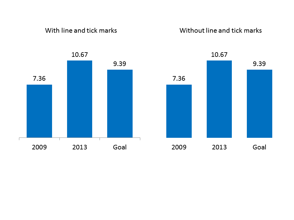
A phrase Nolan used struck me as a guideline for further cleaning up of graphs. He said we should aim to have "fewer distracting pixels" on our slides. He applied the idea by suggesting we remove the tick marks on the horizontal axis for column graphs. The column already shows the audience what label is associated with which data. I would suggest that in many cases we can also remove the axis line, since it often does not add any meaning to the graph. Here is an example of a before and after slide applying this approach. The change isn't much, but it removes pixels that distract the audience from the point of the slide.


Two colors work better than one color for column graphs

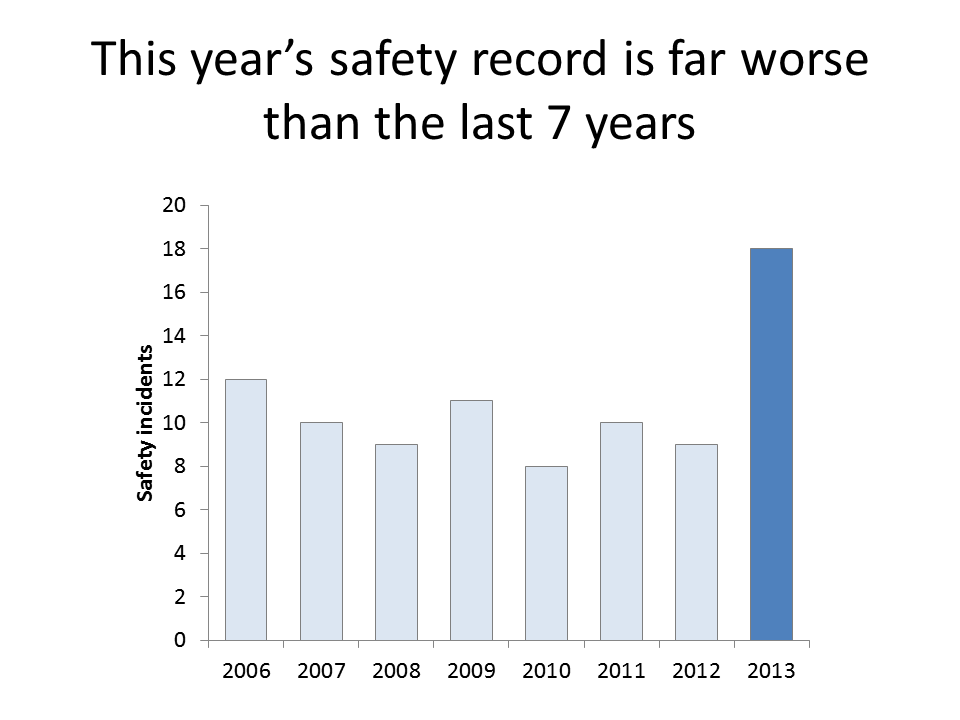
The default graph in PowerPoint assigns the same color for each column in a column graph. I do teach how you can set the color of one column differently than the other columns. The additional nuance I picked up is to apply this more frequently using shades of the same color. Use a muted color for all of the columns except the one or two you want to emphasize. Make those columns a bolder version of that color. By using related colors, the audience knows the data is related, but they also see the difference and will focus more on the columns in the bolder color. Here is an example based on a recent workshop makeover.


Use labels more effectively

Text labels in the graph allow the audience to quickly understand the point you are making. In my workshops I show how you can add text labels to your graphs if the default data labels won't work for the point you are trying to make. I would now add that you can use labels to better tie the explanatory text to the data by using colors for the text. Here is the example from above with a larger, colored text label placed over the default x-axis label. See how the bold text draws your eye even more to the column you want to emphasize.


While I have explained these ideas in relation to column graphs, you can also apply these concepts to other types of graphs, such as bar charts, pie charts, and line graphs. When presenting numeric information visually, it is important that we make the graphs as clean as possible, to focus as much of the audience's attention on the data that supports our point.

Tuesday, January 21, 2014

Presentation Insight: Using Amazon Storybuilder to outline a presentation

Late last year Amazon Studios introduced a tool that will be helpful for presenters. Amazon Studios is a movie studio that helps produce films for film makers. How would their tools relate to presentations? Like the stories that film makers tell, our presentations should tell a story. In this article I want to share how I think the new Amazon Storybuilder can help you outline the content for your story.

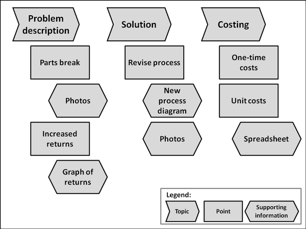
In my workshops I always share my six step RAPIDS approach for planning your message. The P in the RAPIDS acronym stands for Presentation Outline. I show the participants how outlining your message with hierarchically arranged sticky notes is a great way to see the entire message at once. You may also have seen this in the seven day e-course that I offer new newsletter registrants. Here is the example I use in my workshops and the e-course:


Up to now, there has been no easy online way to create these types of outlines. The Amazon Storybuilder tool (at http://studios.amazon.com/storybuilder) may be a great answer to this challenge. It is an entirely web-based tool that is accessible from any platform and any browser. I have used it on my laptop and my iPad quite easily. All you need is a free Amazon account (you can use the one you are already using to buy books if you want).

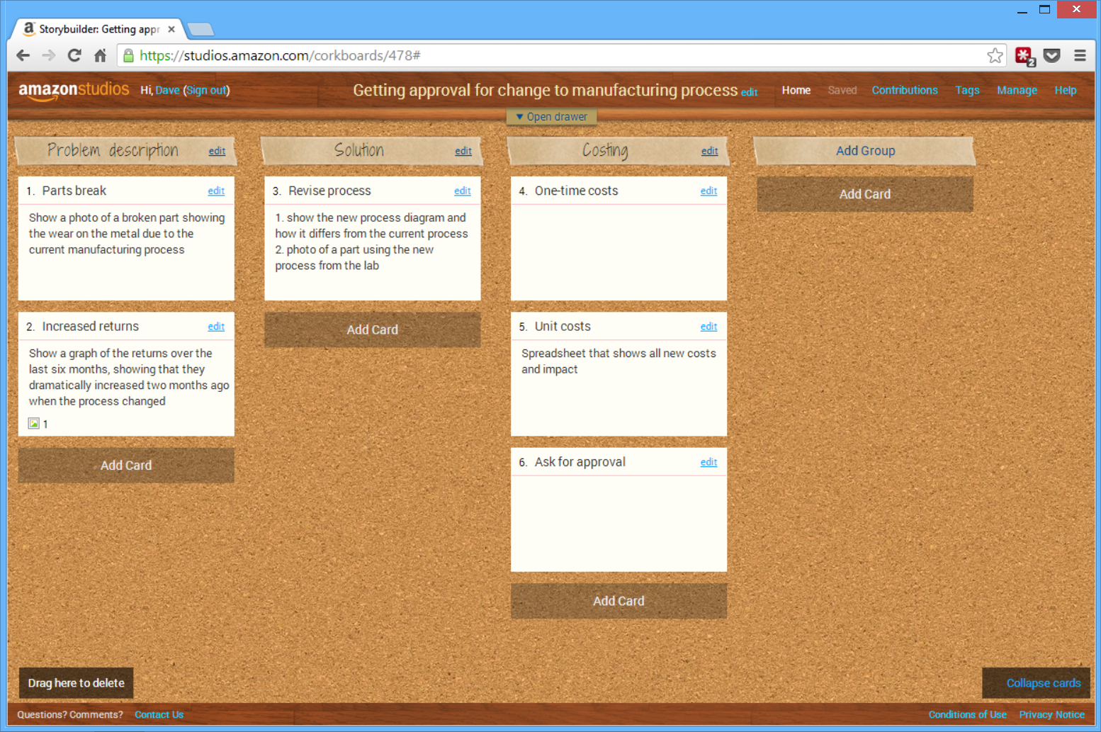
The concept is that you create a corkboard and pin cards to it, similar to sticking sticky notes to a wall or whiteboard. You create a new corkboard for each presentation. The topics you want to cover in your presentation are the highest level of your presentation outline. In Storybuilder, the top level of the story are referred to as Groups, so you would add each topic as a Group at the top of the corkboard.

Under each Group, add a Card for each point you will make when discussing that topic. The Card has a title, which you can use to describe the point. In the description for the Card, add what supporting information or visual you will use to illustrate this point, such as a graph, photo, etc. You can even add an image to each Card if you want to sketch out the visual. I did this recently in an airport lounge. I drew a graph on a napkin and took a photo on my iPad when adding an image to the Card. You access the image feature by double clicking on the card to make it larger and show the additional options.

Just like cards on a corkboard or sticky notes on a wall, you can use your mouse to rearrange the cards on your corkboard, making it easy to move points between different topics if needed. You also see the whole corkboard on your screen, which allows you to see the whole presentation at the same time, so you can make sure you have included everything you wanted to say.

The tool will also allow you to invite collaborators to help work on the outline. They only need a free Amazon account to view and add comments to your corkboard. You can also output the corkboard to a PDF that can be sent to others.

The tool allows you to put cards in a virtual drawer at the top of the board. You can use the drawer to store cards that you know you will need later, but don’t know exactly where yet. You can also use the drawer to hold cards that you remove from the corkboard but don’t want to permanently delete because you may need them later.

Here is the example above done in the Amazon Storybuilder corkboard:


If you have been looking for a visual tool to organize the content for your presentation, one that allows collaboration and visuals to be included, check out the Amazon Storybuilder tool at http://studios.amazon.com/storybuilder. To show you how easy it is to use this tool, I created a 7 minute video that walks you through using it to create a presentation outline. Watch it below: